|
|
Post by Dougie Cleaver ™ on Aug 27, 2008 0:25:09 GMT -5
RATE THE SIGGY ABOVE YOU! [/font] ____________________________________________ Alright, you all know how this goes. If you don't, it's simple. Just rate
the person's signature above you out of ten. Then you must state
why you gave it that rating. You can't just put the person zero out of
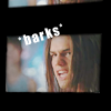
ten just because you don't like them or their character. So, I'll go first.____________________________________________ AFRAID FOR YOU
TENoutofTEN
I just really like it because it is simple and it tells you what the site
all about...blood and power. MWAHAHAHAHAHA![/center] |
|
|
|
Post by .x.Lilia Harvord on Aug 27, 2008 1:06:58 GMT -5
EIGHT outof TEN
I likes it, i does, but i've seen it six billion times xD i love it though. the cross eyed picture is my favorite. Plus, i luff dougie poynter -huggles dougie- not so much dougie cleaver xD |
|
|
|
Post by caitlinmarie on Aug 27, 2008 4:27:48 GMT -5
Eight point five out of ten [/size][/font] Its a very good siggy just the bird symbol in the middle that is pointing at her head is kind of weird.[/center] |
|
|
|
Post by meri grace . on Aug 27, 2008 16:44:45 GMT -5
♥ six point five ,
out of ten.
something about those pics of alexis look a
little odd. and the font's not exactly my favorite.
but it's pretty, nonetheless.
new(ish) sig from teh luffly rcr. =D |
|
|
|
Post by katarina black. on Aug 28, 2008 7:11:13 GMT -5
I looove that sig =D was wondering where it came from for a while now.
eight point nine out of ten
a bit simple than i would normally go for but it works ^^ looks really nice and soft.
|
|
|
|
Post by Joshua Drackette on Aug 28, 2008 14:06:28 GMT -5
7 point 5 out of ten. [/size][/font] I like it, mainly because Sophia Bush is amazing, but the whole three icon thing is kind of plain. =( |
|
|
|
Post by victoria taylor samuels on Aug 29, 2008 18:23:50 GMT -5
eightouttaten
" well i do like sean faris sofreakingmuch
and i like the two outer pictures, but at the moment
the middle one is a little off and the font wouldn't
be my first choice if you know what i mean.
but still, it's still a very good siggy overall!"
** i know the one right now is plain, i'm in the process
of getting a new one from elladear. |
|
|
|
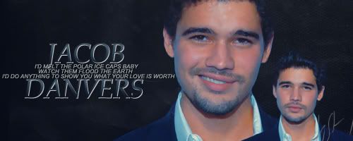
Post by jacob danvers . on Aug 30, 2008 12:19:50 GMT -5
» eight ,
out of ten.
so i decided to do this a little
differently, one set of comments for
the graphic part of sigs and the other
for the oh-so important aspect of text.
just add the two numbers up and you'll
get the big number. make sense? it should
since it's not really that complicated. xP
graphics (5/5):
the icons are lovely and, as random
as it may be, seeing how you do the
two matching icons on either side of
a non-matching one makes me happy
since that's normally what i do when i
have icons in posts or sigs or whatever.
=P oh, and the fact that leighton is gorg
might have something to do with it. >.<
text (3/5):
i love how you did her name, and the little
'ilydevon' is just cute in all of its simplicity.
only problem that i have with it is that it
seems a little bare, textually. it might be
because you ran out of characters to use,
or it might be because of something else,
but that's all i've got to say.
yet another new sig from teh luffly rcr.
-squeezes- |
|
|
|
Post by christa gennifer von ness on Aug 30, 2008 18:51:58 GMT -5
eight.fiveouttaten
" dude i'm telling you here and now
i am using your formatty cuz i likes
it soooooooo much! "
graphics: 4/5
okay, don't get me wrong
i really do love steven strait
and i love jake danvers -hugs-
but those pics don't click with
me as jake ya know? still besides
that point, i still like them =]
text: 4.5/5
yup, i like the lyrics and how the
name is split with the lyrics in between,
in other words, i love the format but i'd
like it better if the middle line didn't
stretch out as much and the whole thing
was a tad more balanced. but otherwise
it's pretty snazzy!
|
|
|
|
Post by Joshua Drackette on Aug 31, 2008 2:31:33 GMT -5
eight out of ten
I like the pictures you used and how the text sort of matches the border, but I'm still sort of against the whole...non-banner type siggys. =( Guess I'm a hard person to change. |
|
|
|
Post by christa gennifer von ness on Aug 31, 2008 7:45:29 GMT -5
nineouttaten
graphics: 4.5/5
again sean faris is uber hot
scuse that, it won't happen
again, lol. anyways, i love all
of those pics, except for the
one on the far left kind of bugs
me cuz his head looks kinda
squished-ish? but the coloring
is absolutely amazing so i love it!
text: 4.5/5
i love the text and how it's on there
but i wish his name stood out more.
|
|
|
|
Post by Dougie Cleaver ™ on Aug 31, 2008 12:01:47 GMT -5
CHRISTA VON NESS ! [/font] ___________________________________ EIGHToutofTEN[/font] GRAPHICS[/font] THREEoutofFIVE
Well, I do like the pictures of her.
Rachel Bilson is a very beautiful girl.
However, it is just two pictures
stuck together with a boarder
around them. Other than that,
they look nice.[/font] FONT[/font] FIVEoutofFIVE
I just love all of it. I love the colour,
the font and the song is pretty
awesome, too. I just love your font
in general, so high score for you!
YAY WHITNEY![/font][/center] |
|
|
|
Post by caitlinmarie on Sept 1, 2008 1:08:19 GMT -5
Alright so I am going to borrow your idea Amy.
I hope you don't mind I just thought that it was a
good idea. I am crediting you for this. I didn't come
up with that format. So I take no credit in it at all. [/size][/font] Eight point five out of Ten[/font] (graphics)
four point five/five
I would have to say that those are
some really nice graphics of Dougie
I like how they are put together to
they are really nicely place together
to.[/font][/color] (text)
four/five
Its some really good lyrics but
its sometimes hard to read some
of the text but its still really
good.[/size][/center] |
|
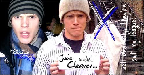
Jude Cleaver ™
 VAMPIRE!
senior year
pure-blood
out of my LEAGUE
Posts: 76
|
Post by Jude Cleaver ™ on Sept 1, 2008 4:06:05 GMT -5
CAITLIN EDWARDS ! [/font] ___________________________________ SEVENoutofTEN[/font] GRAPHICS[/font] FOURoutofFIVE
I love those pictures of Alexis
Bledel. Although, I think it
would work better if she were
an angel, not a werewolf. I
also find it kind of plain, but
that's just me.[/font] FONT[/font] THREEoutofFIVE
It's alright. I mean, it just doesn't
suit the signature as a whole. I
do think it suits the werewolf role
though. But, still, it just doesn't
quite fit.[/font][/center] |
|
|
|
Post by harper valentine . on Sept 2, 2008 16:52:13 GMT -5
xo nine ,
out of ten.
oooh, wow. it seems as though
i'm a trendsetter of sorts. xP
berry flattering. -nodnod- <3
graphics (4.5/5):
the only part that i really have a problem
with is 'the skater dude' part, the color's
a bit hard to read. besides that, great
pictures! ( gotta love those facial expressions).
text (4.5/5):
by text, i don't think y'all realized that
i meant the text under / around the image,
not actually on it. >.< but that's cool too,
just thought that i ought to point that out.
=P anywho . . . i love most everything about
the text in all of your sigs, your use of lyrics
always seems to make me smile and the colors
bright and attention-grabbing. lovelovelove!
so, on to my sig! -giggles- rcr is so freaking
beastly, don'tcha think? -hugsqueezes- it
makes me so freaking happy just looking
at it. =D |
|